City of London Corporation

The City of London Corporation is the governing body of the Square Mile responsible for providing local government services for residents and City workers based within the Square Mile.
Their Education Strategy Unit came to us needing help in turning two very different, lengthy documents into publications which would inform, inspire and engage their readers.
How did we deliver?
One of the documents was an evaluation report where our first task was to make greater use of both colour and photography so as to enhance visual appeal and facilitate intuitive navigation for the audience as they made their way through the sections of the report.
Our designers strategically chose a distinctive set of colours which would allow readers to quickly and easily recognise and identify transitions in the text.
Each chapter was given its own colour and further marked by a full page photograph to the left of the start with an overlay of the same colour as the chapter starting. Real photography was used throughout as opposed to stock to give a more personal feel and act as a reminder throughout of the very real people the text was referring to.
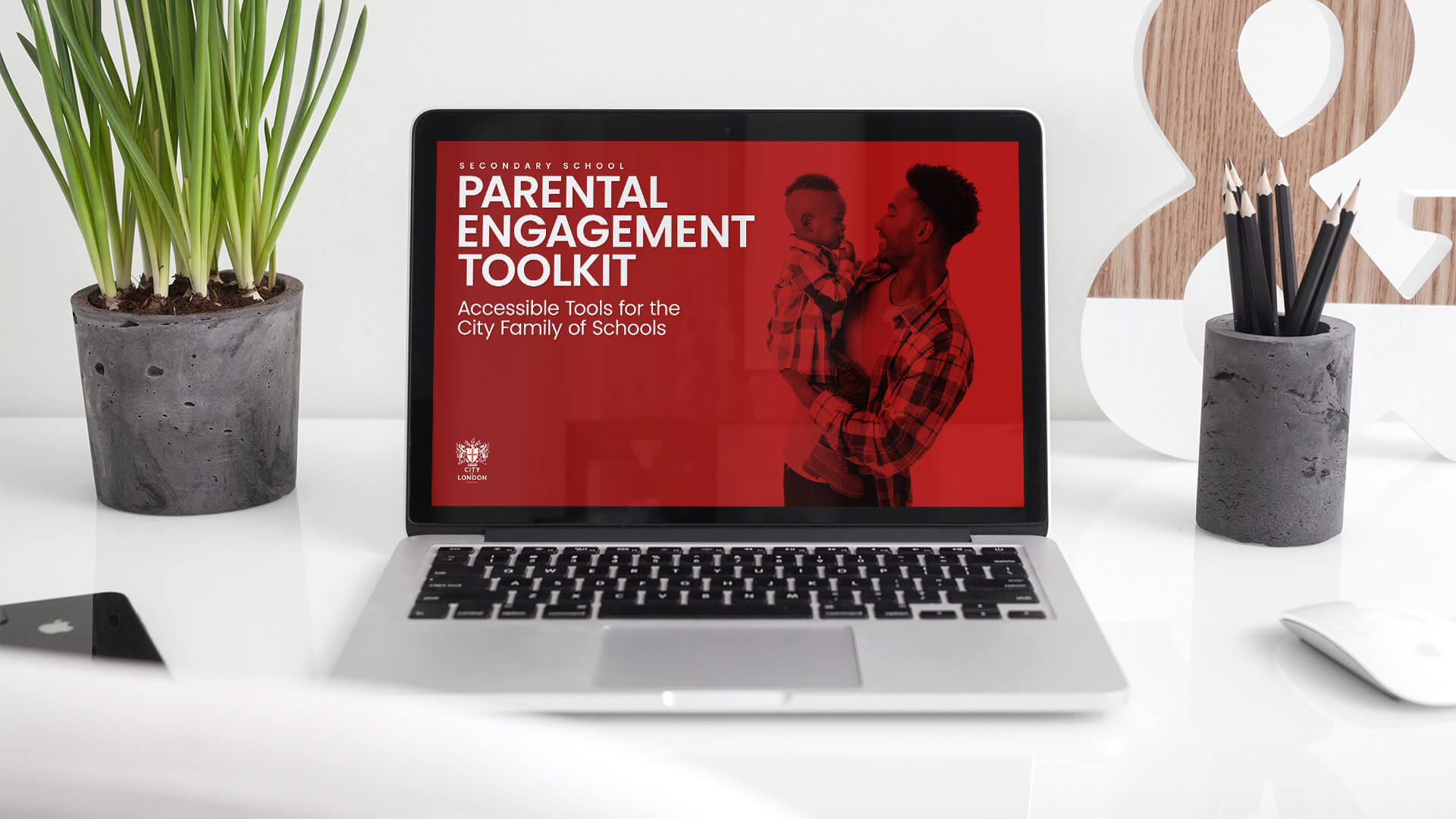
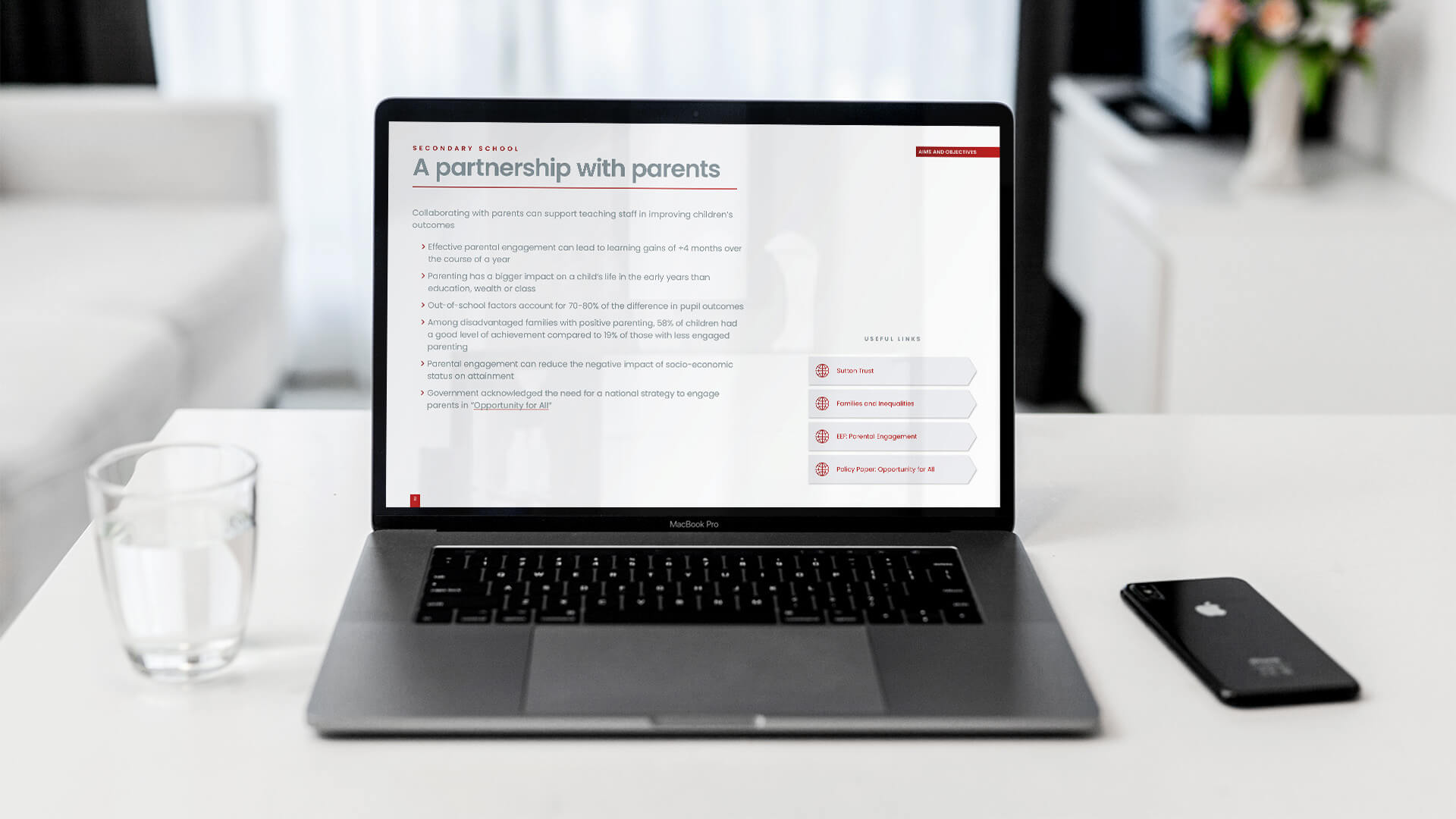
Following the completion of the design of the evaluation report we worked with them to design a publication for teachers, a parental engagement toolkit. The toolkit was designed in a landscape format and in this instance we were required to more strongly apply and follow the Corporation’s own branding.
Consequently, we made use of the red to mark the different sections and separate the headings, with a thin red underline, from the body text and thus make the hierarchy of the document clear.
While a formal document with many supporting references and additional materials it was not an academic publication and we therefore designed all the useful links to be contained within interactive boxes and change from red text on grey boxes to white text on red boxes when hovered over.
Could typesetting elevate your brand?