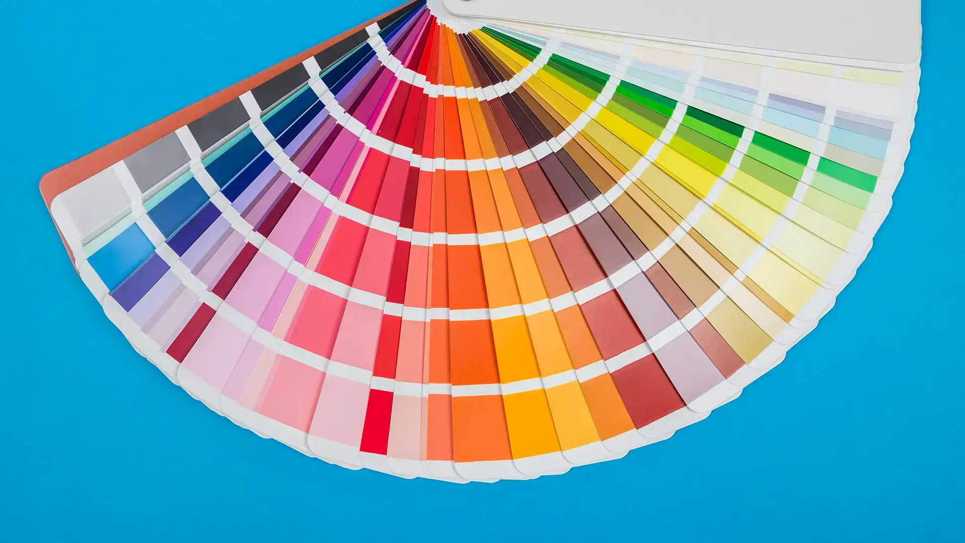
Choosing colours – whether for your home, your brand or your project can be fraught to a level out of all proportion to what is so superficially superficial.
But in reality, colour is not superficial is it – there have been many reams written on colour psychology and why we react in the ways we do to it, however we will leave this one for another day.
What we want to focus on here is one very specific point when it comes to colour and what you need to be aware of – contrast.
By contrast, what we mean is the difference in brightness between text or an image and the background colour behind.
There are trends in the use of colour as there is in everything and a trend in the use of muted colours can often result in a contrast problem.
Low contrast is hard to read because it strains the eyes as they have to work harder to pick out text from the background it’s on. This can make it tricky to read from a distance and challenging at any distance for people with certain types of low vision.
And, as many people discovered when trying to take advantage of the sunshine and work outside during the first lockdown – low contrast is also of course harder to read on screens when outside.
However, beware of trying for too high a contrast. For example, a pure, 100% black background with 100% white text – the pure black kills the light making your eyes work harder as they open wider to absorb more light. This is what makes text look fuzzy as you get the impression that the white letters are fading into the background.
If you’re not sure how your colours work when it comes to contrast and accessibility there are many free web tools available that will help you. For example: WebAim
And for the advice of our design team: Get in touch


